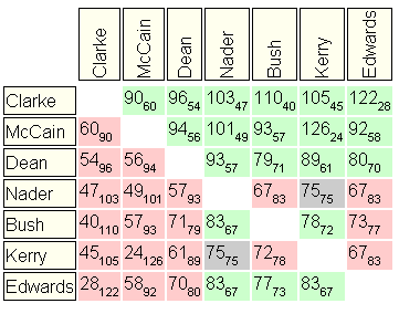
"Pairwise matrices" as are often are used to show the intermediate results of a Condorcet election. Unfortunately, it is very difficult for most people to make heads or tails of such a matrix. It might be fairly easy to see who won the most pairwise elections, but determining the winner, or how close the runners up were, is nearly impossible with a quick glance. In other words, it is not immediately "grokkable". There are other ways of displaying the same information, but most simply take up a lot more space but do little to make it easy to take in all the significant information at once.
On web based polls, people are used to seeing something more graphical, such as a bar graph. These do a wonderful job of showing the "spread" of the election. It is very easy to see that one candidate is just barely preferred over another, or that another candidate didn't even come close, etc. Unfortunately, distilling the information in a Condorcet election into the numerical scores necessary for a bar graph is not at all straightforward. Even if we can assign each candidate a single numerical score that is consistant with the election method used, the resulting set of scores do not convey the richness of information that is in a pairwise matrix. Furthermore, compared to the scores returned by a plurality or borda count election, numerical scores from a Condorcet election may have some instability and other counterintuitive properties that might cause such a bar graph to be rejected by some as being rather meaningless.

Above is a simple bar graph. I would expect that we should offer this as an option for those who are not so interested in the richer information.

By offering an "advanced mode" bar graph, as shown above, we can retain the graphical "grokkability" of a bar graph while also showing a great deal of additional information. The thick black vertical lines show the "composite score" of each candidate. A candidate with a higher composite score than another candidate beats that candidate...in other words, it is the score that "counts".

The thinner vertical lines, of which some are red and some are blue, are "relative scores". Mousing over a relative score line will result in a popup item (as shown above) which shows which candidate the score is relative to, and their pairwise results. In the example image, the popup over one of the lines shows that Dean beat Kerry by 2411 to 1736. Kerry therefore has a relative score for Dean of (1736/2411)*14.3%, which works out to 10.3%. Note that this is somewhat higher than Kerry's composite score of 9.2%. In the example, you will notice that the lengths of the highlighted parts of the Dean and Kerry bar graphs are in the ratio of 2411 to 1736.
The thin vertical lines that are blue are used in the calculation to produce the composite score, while the red ones are not. Having some relative scores which do not affect the compostite score is consistant with election methods which strive to meet the criterion of "independence of irrelevant alternatives". Typically, the blue ones are either going to be adjacent candidates (directly above or below in the ranking) or involved in some sort of cycle with the candidate in question.
There are several intuitive properties of the election that can be immediately discerned from this bar graph that are not discernable from a simpler bar graph, and would be very difficult to pick out of a pairwise matrix. For instance, the narrower the green area in the bars, the more "consistant", stable, and non-cyclic the election.